Thanks Jonny Bobgan aka @inklineridge for taking part in our illustrators’ interview series!

How long have you been drawing?
For as long as I can remember. I loved drawing as a kid, though I wasn’t all that naturally talented at it. I like to think I was always the best artist in the room—unless there was another artist in the room.
Despite not being extremely gifted, I was fortunate to always have the support of my parents, teachers, and friends, so I just kept doing what I enjoyed. Eventually, I discovered my strengths and got better through practice. Too many adults don’t believe they have the talent for creating art, but a lot of the time it’s just because they stopped doing it so early or stopped enjoying it for the wrong reasons.


Why do you draw?
Usually because I’m inspired by other artists creating stunning work. I see a piece that is beautiful or meaningful, and I’m reminded of the importance of creating and putting artwork out there for people to enjoy. It’s also a really relaxing process for me. I have ADHD and drawing is an effective way for me to slow down and relax while keeping my mind and hands moving. As a student, I was constantly doodling in class, which always helped me attention (though some of my teachers found that hard to believe).
What inspires you?
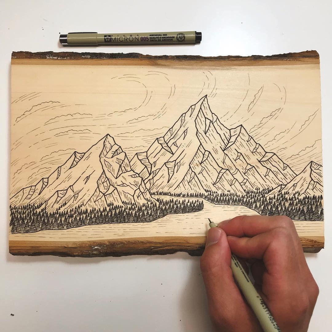
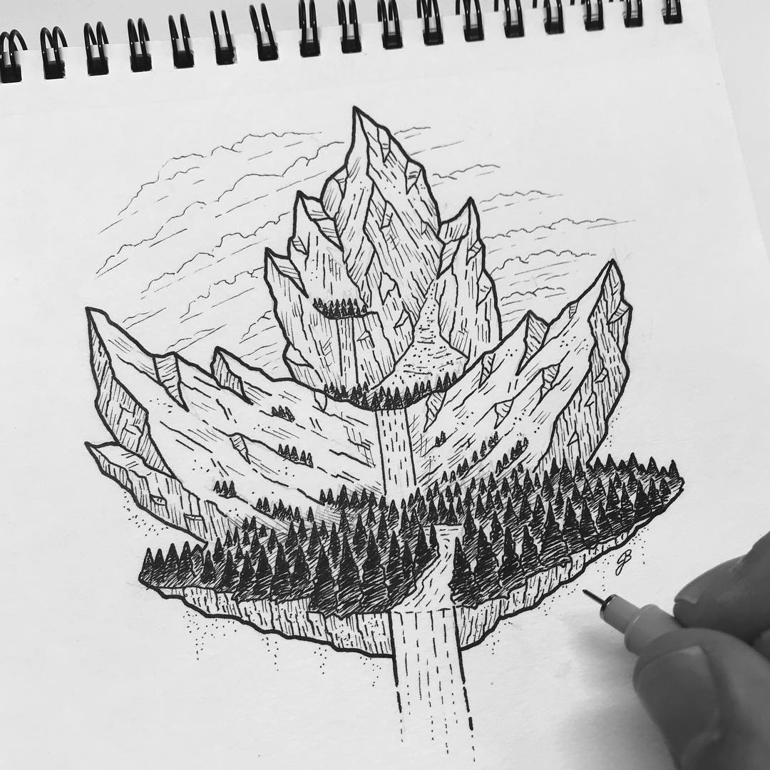
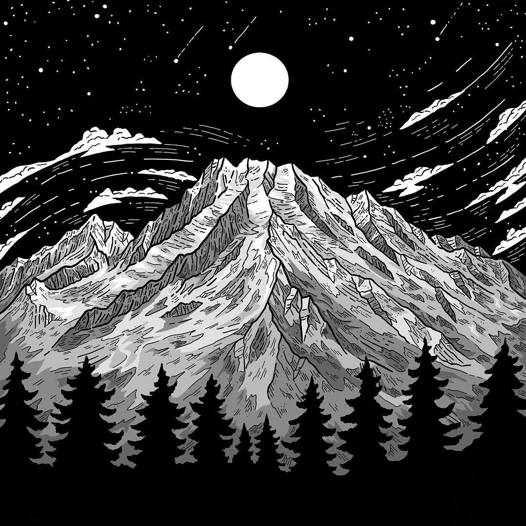
Other than the inspiration I find in other art, I’m constantly inspired by the beautiful and dramatic world around me. It could be something as little as a leaf or as big as the mountains that gets me feeling creative. And now that I have kids of my own, they inspire me to keep drawing. I see their fearlessness when they create and when they use their imagination. I also want them to see what happens when you pursue what you love and commit yourself to making it a part of your life for the long haul. I remind them that you can make money doing what you love, and you can continue to love doing something even when it doesn’t bring a profit.

Is it a hobby or your career?
I’m fortunate enough that it’s both. Unfortunately, Inkline Ridge no longer produces an income for me after the brutal Instagram algorithm updates last year; my follower count is 6,000 lower than it was one year ago after a steep decline in visibility. However, I do still work on occasional commissions—most recently for Patagonia—and I do a lot of sketching and illustration as part of my full-time job as a freelance graphic designer. This work tends to be much different than what you see me posting to Instagram, but there’s just as much—if not more—creativity behind it.
Digital vs traditional?
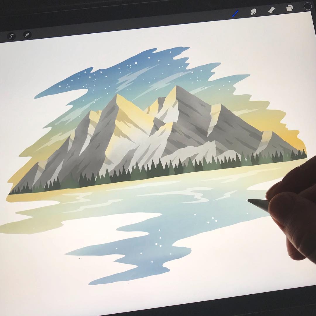
I love spending time with both, so I tend to go through phases. This also depends on the types of projects I’m working on. I tend to work on a lot of digital illustration to support the brands I work with as a freelancer. Working digitally allows me to work efficiently and shift direction and adjust details based on client feedback without taking a hit to my time or their budget. With modern tools like the iPad, Procreate App, and Apple Pencils, I’m still able to add a hand-rendered feel to the digital artwork when needed.
What’s your process?
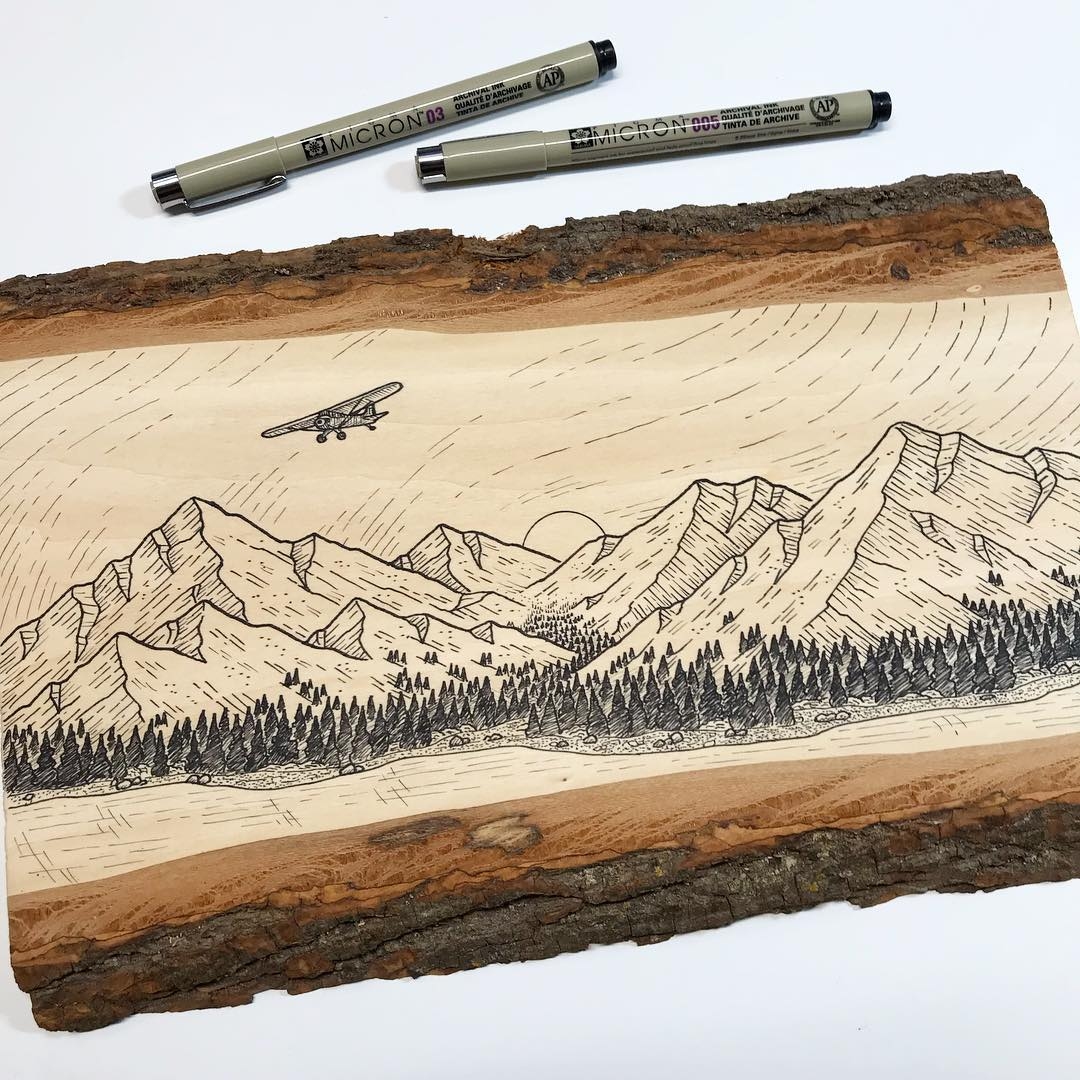
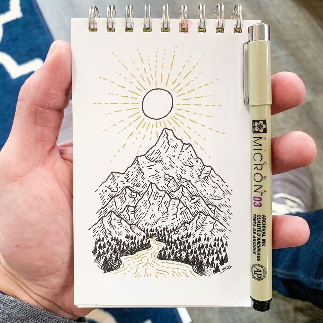
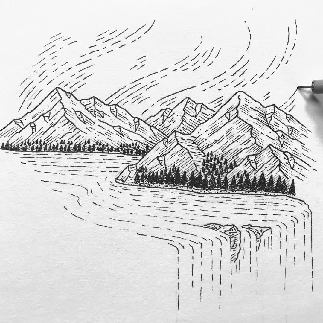
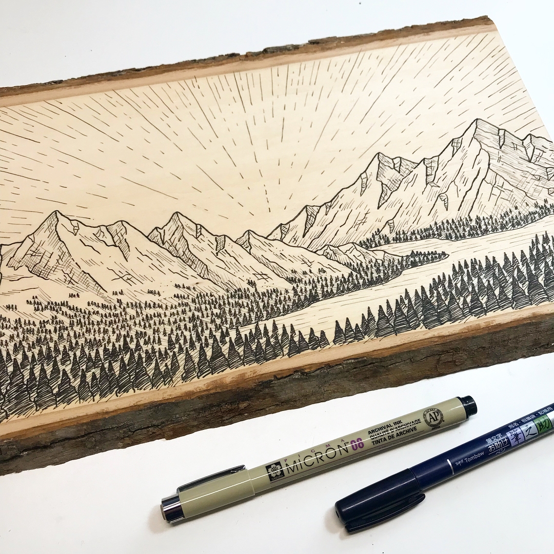
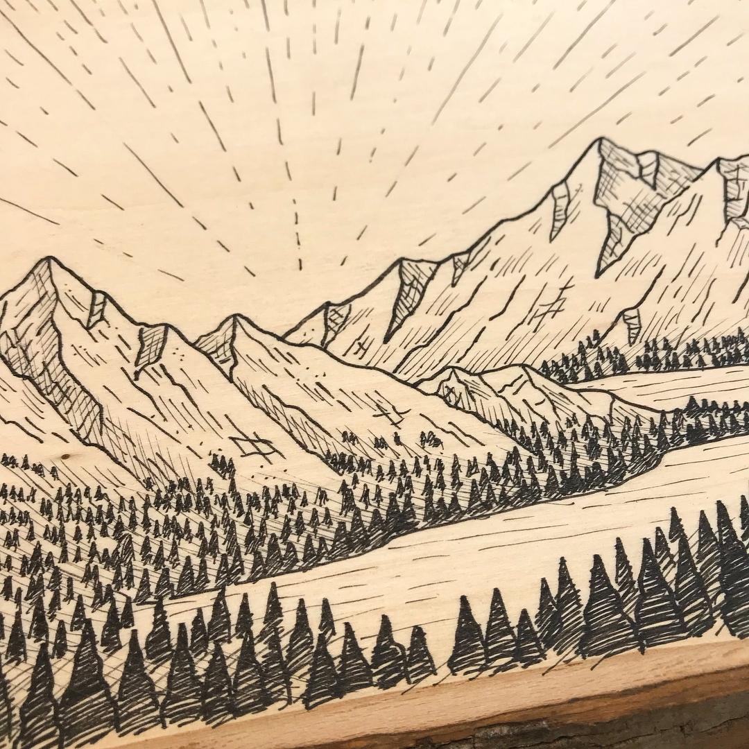
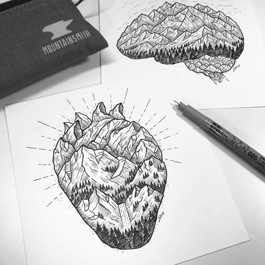
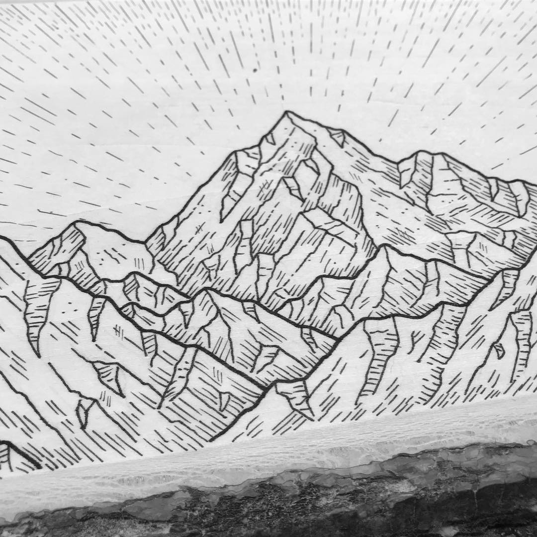
This definitely varies by project, but if I’m sketching in my classic Inkline Ridge style, I honestly don’t have much of a process. If I’m referencing a real place, I’ll sketch some primary lines in pencil to get the overall shape and proportions right before I pick up my pens. If I’m drawing a more stylized landscape, I’ll often skip the pencil stage and just go for it.
That said, my process for client work goes much deeper, as I’m generally trying to tell a deeper and clearer story for their brand. There’s a learning and planning process that comes before anything to ensure the artwork is not only beautiful, but conveys the right message and tone to the right audience.
How long does it take to create it?
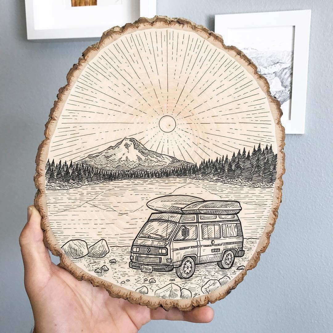
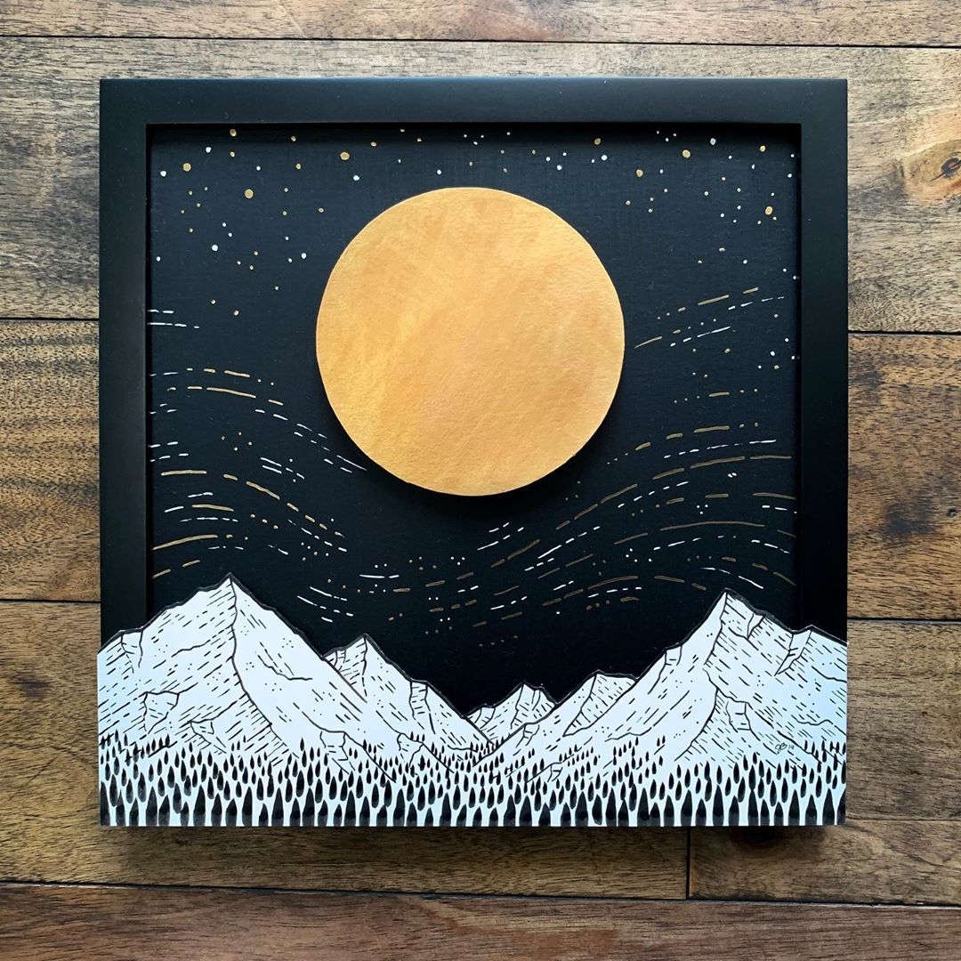
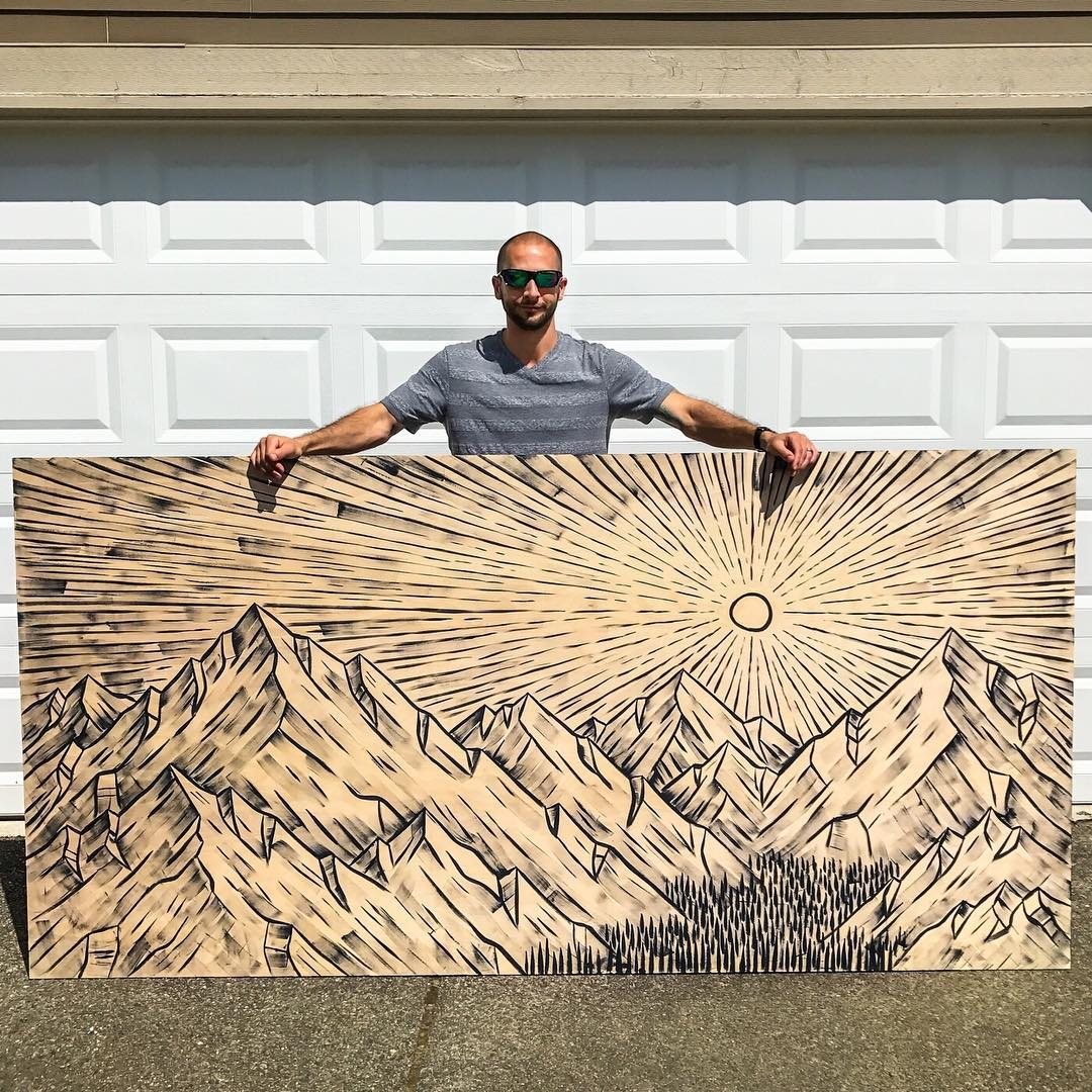
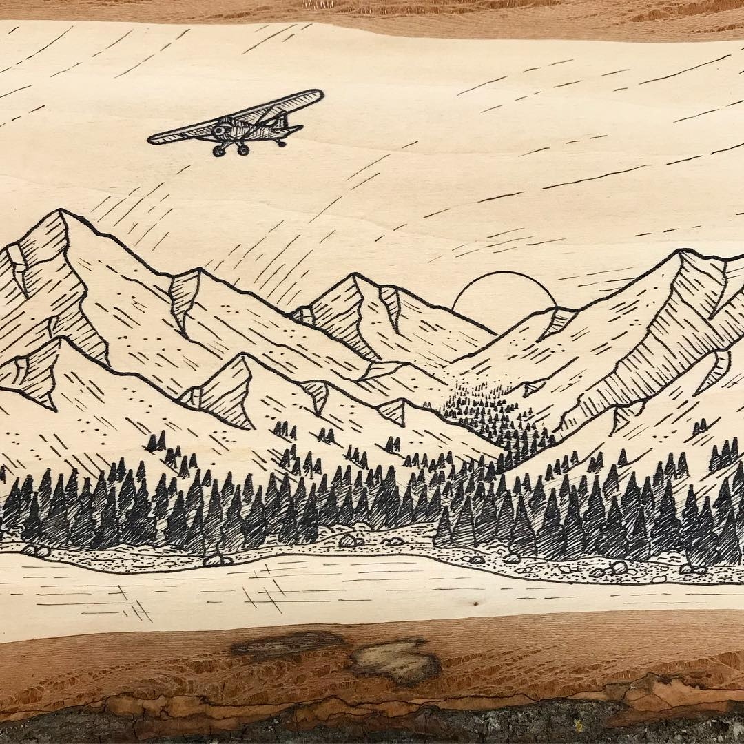
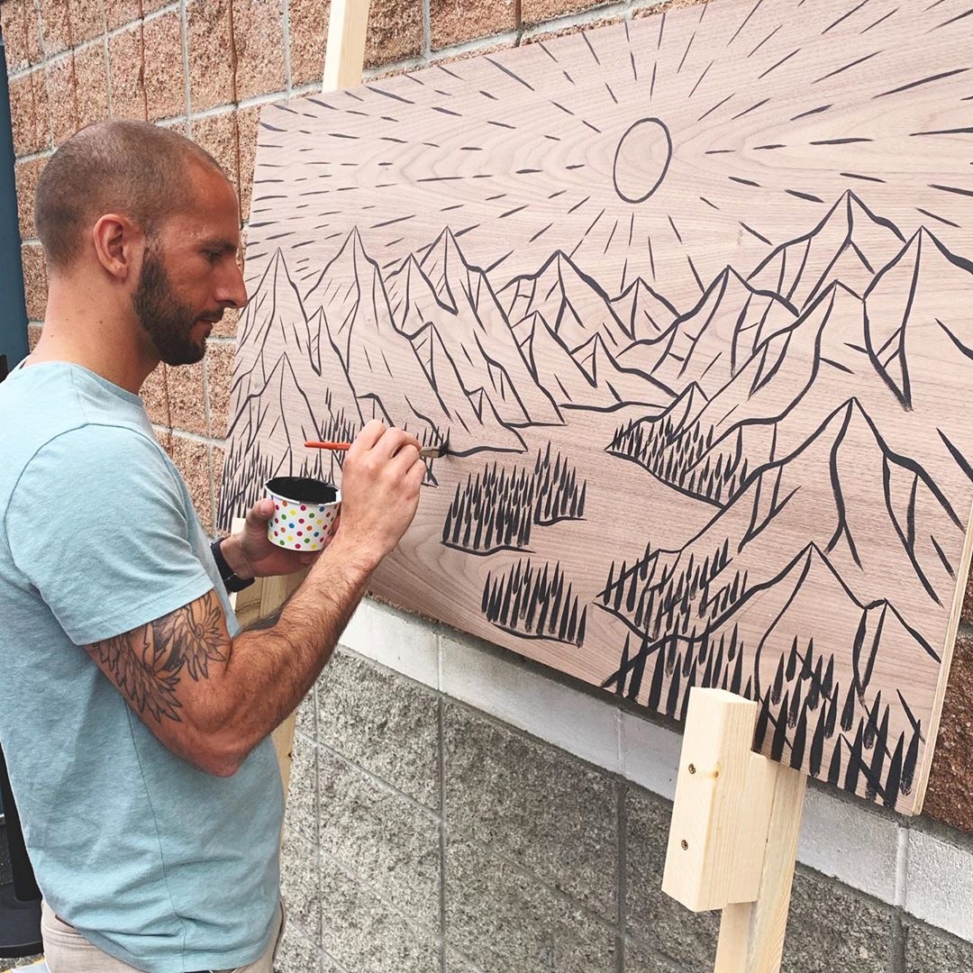
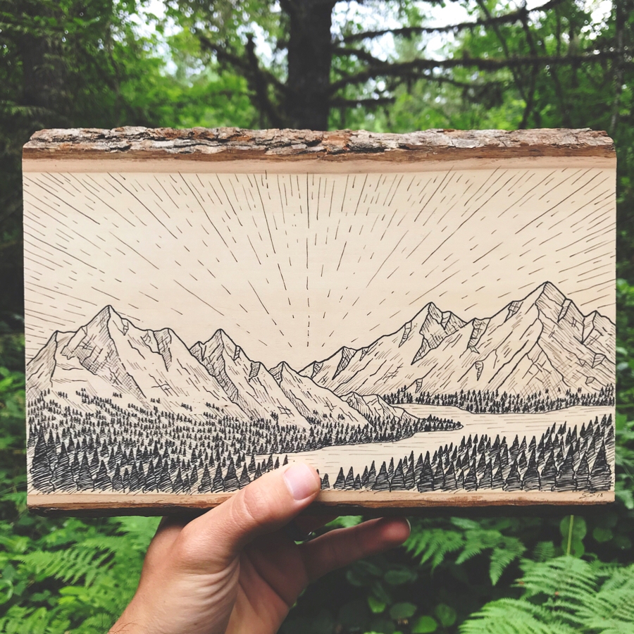
Nearly all the pieces I post to my Instagram account take 15–60 minutes, though my bigger acrylic paintings on wood tend to take 2–3 hours. Often, my smaller drawings will take longer than my really large drawings because I’ll get lost in the details. Even though my trees are usually just little scribbles, it still takes time to lay down a few hundred.
What is the biggest obstacle that you have faced?
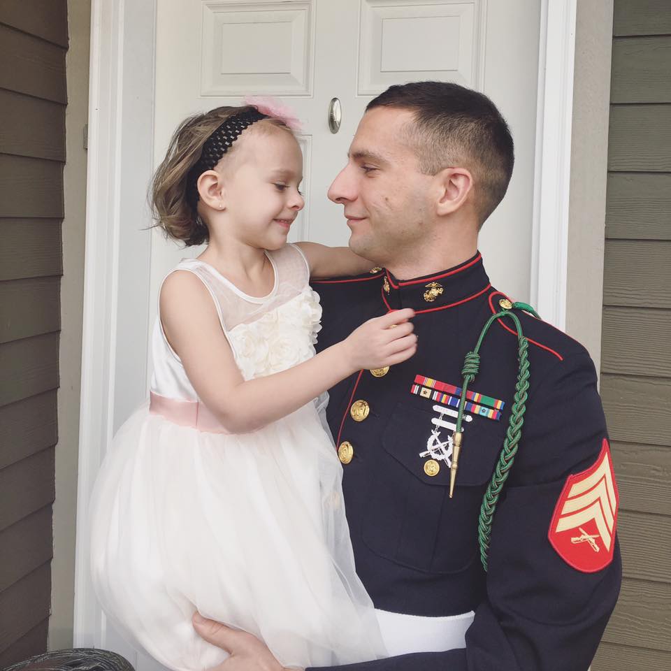
Four years ago, the agency I was working for went under and I was owed a substantial amount of money when I left. My employers at the time were like family to me, so it was financially and emotionally draining for us. To make things worse, my wife and I had just taken custody of my teen brother and sister when we already had to kids of our own. Our mom had passed away a year before, and their dad had just been arrested. So, overnight we went from raising two small kids to also supporting and guiding two struggling teenagers. Desperate to support my family of six, I frantically grabbed hold of some freelance projects while I figured out what was next for us. Needless to say, this period of transition in our lives was turbulent and testing—much more so than my four years as a Marine.

What is the proudest moment that you have achieved?
Overcoming those hardships is by far my proudest moment. Not just because I’m proud of myself for pushing through and coming out stronger on the other side, but because I am deeply proud of my family; my wife for lovingly and meticulously managing our crazy family life, and my kids (brother and sister included) for keeping their heads up and moving forward when times were rough.
You have one day to live; how do you spend it?
With my family on mountain trails, exploring this beautiful world and laughing along the way.
How can people get in contact with you?
Social Links:
IG: @inklineridge
Website: Inklineridge.com
Website: bobgan.com